Just before joining the Mörk Borg release party in Stockholm earlier this March, I had the pleasure to meet Dan Algstrand, a.k.a. Norse Dork, who graciously took it upon himself to be my guide not just around our corner of the city, but also through the Swedish RPG scene in general. Later that evening, I managed to corner him for a few questions. I quoted him already in my writeup of the release party, but here is the interview transcript in full.
Mottokrosh: Let's start by introducing yourself a little, what you’ve worked on, and perhaps what you’re most proud of.
Rumor has it that I’ve worked on every Swedish RPG ever. This is not true. But I like that rumor, so I will not deny it. It was 20 years ago that I worked on my first RPG, the 6th edition of Drakar och Demoner (Dragons and Demons). The very first edition was just a Swedish translation of Magic World for Basic Roleplaying from Chaosium, back in 1982. And then in 2000, I did the graphic design for the 6th edition of that game.
Mottokrosh: So do you know the Chaosium people quite well?
No, I haven’t met a single one of them, but I’ve made friends with most of the people in the Swedish RPG scene for the last 20 years, for one reason or another, and some of them want me to design or lay out their games. As long as I get paid I’m happy to do that. *laughter*
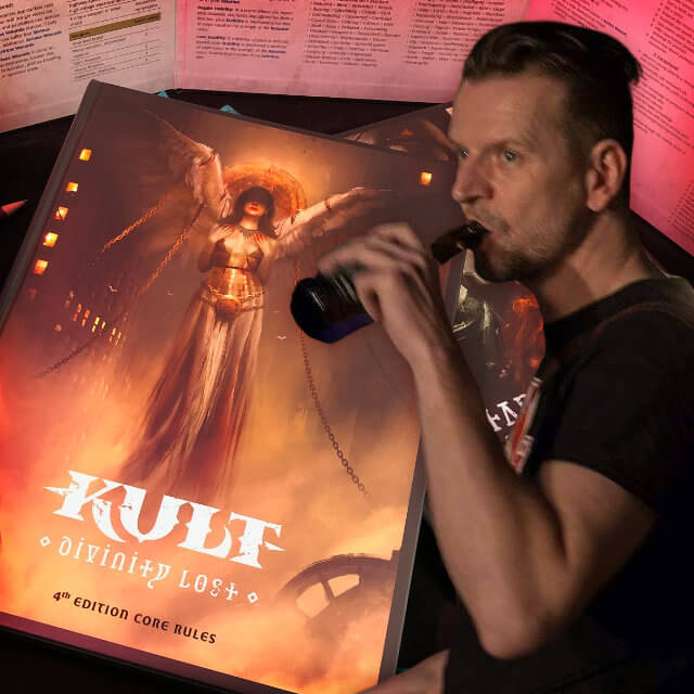
Mottokrosh: Capitalism aside, you have done the graphic design for the new edition of Kult - Divinity Lost, which looks absolutely amazing, and when it came out it set a new standard for what games could look like. How did that come about?
Well, first of all, I had a really, really good creative director in Petter Nallo, who is with Helmgast, the publisher. He had a very clear idea of what he wanted the game to look like. So he provided me with a lot of reference art that I could like at, and then I googled a lot of orthodox iconography, and asked myself how can I introduce this into the layout?
I also looked at the first edition of Kult, because I wanted to incorporate some of that stuff, and the main color scheme is black and red and white, and that’s straight from the original.
Mottokrosh: That’s a good color scheme to work with.
Yeah, the Nazis thought so as well (*laughter*) but it’s actually the strongest color scheme you can have. Bright red, black, and white. It’s got the biggest contrast between all three colors.
Mottokrosh: Did you also lay out the bible version of Kult, and was it a pain it the ass to do?
No, the bible edition was a walk in the park, compared to the other books! Because in the other books there is no single text block that is rectangular. Everything is wonky. But in the bible edition everything is rectangular, and there is only text. So it’s a bit like typesetting a novel. It’s pretty easy.
But there is a new bible edition coming out soon.
Mottokrosh: New one? You heard it here first, folks!
Yeah, with a better index, and it’s going to be printed in two colors. Red and black, on white paper.
Mottokrosh: Wait, two colors and black? Luxury! This may be a loaded question, but aren’t indexes the worst to make?
They are, they are! They take forever, and if you make an excellent index, no one will thank you or commend you for it, but if you make a crap index, people will hate you forever.
Mottokrosh: You’ve done a bunch of stuff for Free League, and you’re working on the new Vaesen RPG. What’s been your approach when it comes to the layout for that?
First of all I’d like to say that for everything I’ve made so far for Free League, Christian Granath is the graphic designer. I am just the layout guy. He is responsible for the main look of everything, and I just put stuff in the right places.
With Vaesen I’ve got a bit more leeway. He made a few example spreads for me to look at, and I got to tweak them to my liking. When it comes to Vaesen, I’d say Christian and me are equally responsible for how it looks, but most of all it will look amazing because of Johan Egerkrans’s fantastic illustrations. I’ve been wanting to do something with Johan for years, so this is like a dream come true. He’s an amazing artist and I just want to do a layout to highlight his amazing artwork.
Mottokrosh: Do you have a project that you’ve been wanting to get out there, but for whatever reason haven’t been able to yet?
I do. I’ve been wanting for ages for there to be an awesome, easy to pickup, sword and sorcery game, Conan-style. But everyone who decides to make a Conan game… it just gets bloated (*laughter*). Too many pages, too many checks, too many rules.
Mottokrosh: So are you working on it?
I am. In my drawer I have a halfway finished, really rules light, swords and sorcery Conan game. But since I'm acquainted with the guy who owns the license for Conan…
Mottokrosh: Isn’t Conan in the public domain?
Not everything. But if I only used what Howard wrote, and not mention Conan, I would be safe. But I don’t want to piss off Fredrik [the license holder]!
Mottokrosh: So in your version, at what point—if at all—do you introduce the famous “What is best in life?” quote?
I think that would be on the title page.
Johan Nohr (*walks in*): Not sooner? (*laughter*)
Mottokrosh: Yeah, come on, why are you holding back? (*laughter*) On a personal note, I just want to add that it’s been so fantastic coming to Sweden and not only being greeted by lots of friendly people, but literally being guided, being told “meet me at the pub and I’ll introduce you to people and stuff”. It’s been fantastic.
It’s what I would wish to happen to me if I were in your position.